Click here to download this week's dataset as a CSV
Click here to download this week's dataset as a Hyper Extract
Data Storytelling
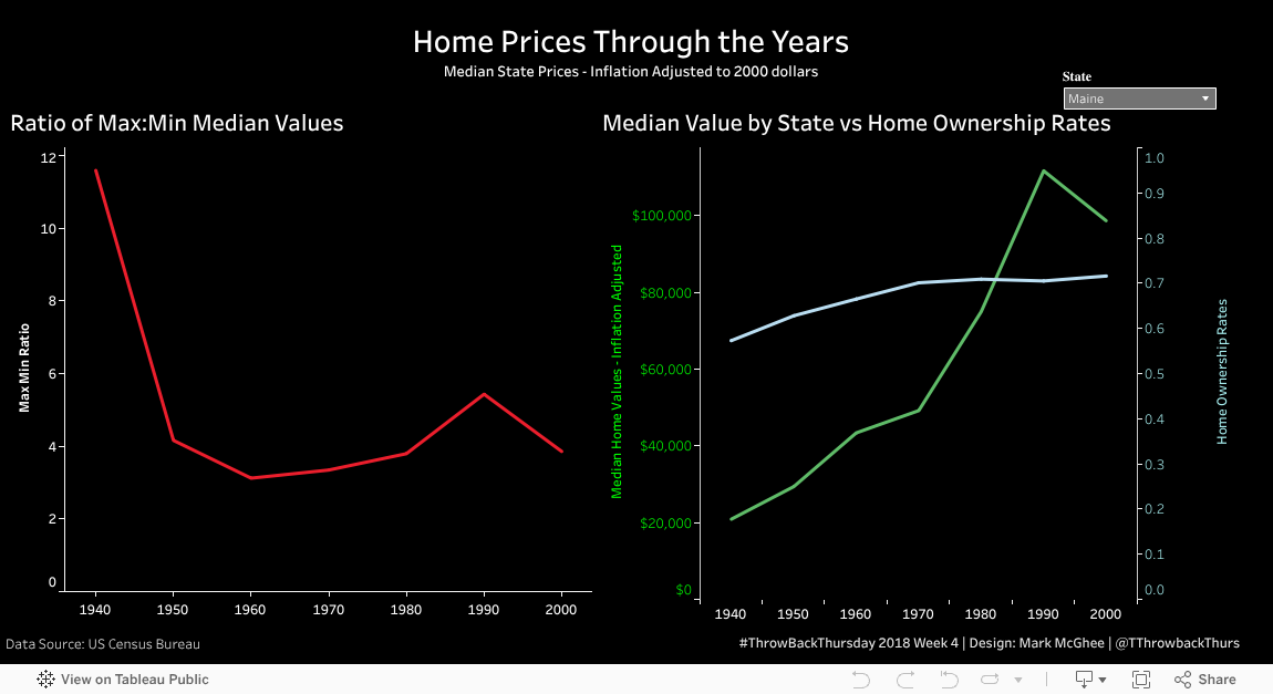
I wanted to look at some basic trends in home prices over the years. One aspect that caught my attention is that while the absolute difference in median prices when comparing states has increase, the relative difference has not. That is, the ratio of the most expensive state (defined by highest median value) to least expensive state (defined by lowest median value) was highest in the earlier years of the data.
Data Viz Approach
Also, I wanted to attempt to leverage some of Tableau's statistical capabilities. So while the viz on the right does not show a trend line, the tooltip contains the slope of the trend line and interprets it accordingly. So that as we select different states, we can see how much the value is increasing per year (even with using inflation adjusted numbers) according to the slope of the trend line. Also, this slope is interpreted for the home ownership rate.
Data Source
This week's dataset comes from the United States Census Bureau's Census of Housing.